

I wrote this article by hand but AI made the video. Shout out to arcade.software which was so impressive!
Chart crimes used to be cruder. Truncated y-axes, dual axes rigged so the lines cross at the dramatic moment, date ranges that start at the bottom of a dip. Enough public shaming happens on LinkedIn and X that the crude stuff has gotten rarer. What survives is subtler, and the fun with subtle chart fraud isn’t catching it, it’s asking what the fraud tells you about who the chart is for.
Consider this AP chart:
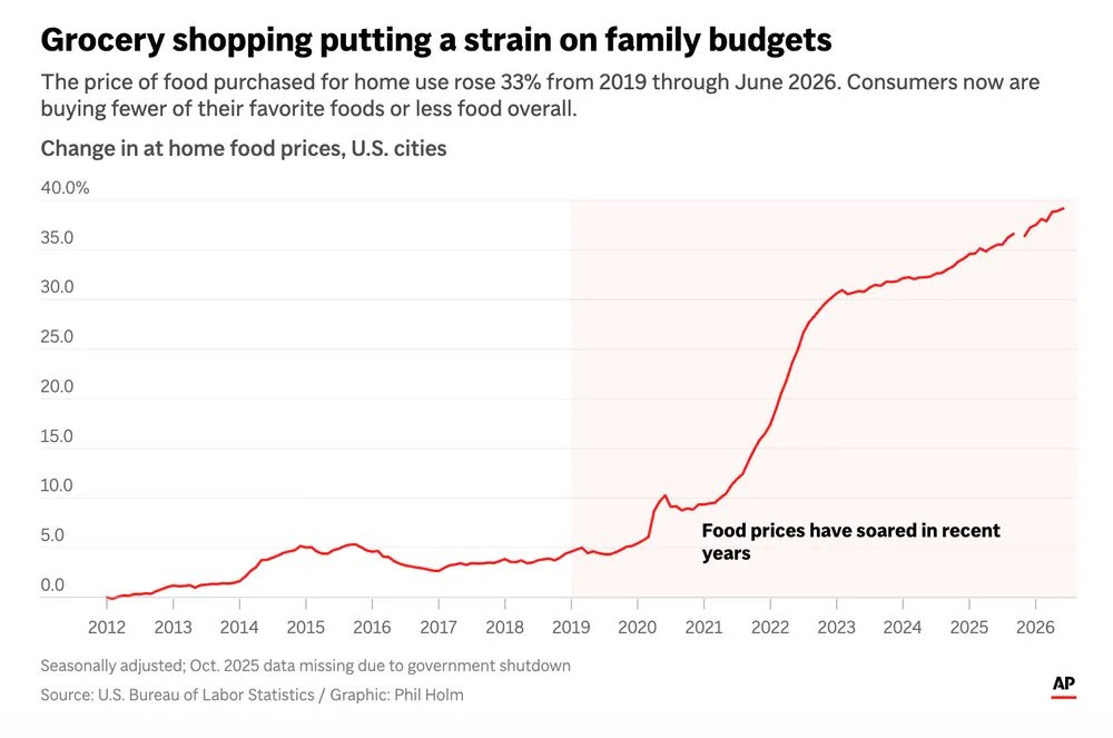
At first blush, it looks interesting and worrying - there’s people in America, the richest country on earth, who can’t afford food. And year after year it’s getting worse, because of (insert whom you want to blame for inflation here).
But if you think about it, the chart pretty much just presents a truism: there is inflation. And presents a fact we’ve all been told repeatedly - there was a lot of inflation in 2022. It doesn’t help you understand if inflation was more or less than usual outside of 2022 (no contrasting line, inflation presented as a cumulative number), nor what kinds of pressure it puts on families (no data on how incomes have changed), nor what kinds of pressure it puts on families who suffer the most food insecurity (no data on food insecurity surveys or bottom decile incomes).
It’s a chart with obvious information (there is inflation and there was more in 2022) presented in a decidedly unhelpful way (cumulative rather than YoY).
To be fair, cumulative is how prices feel - nobody experiences a YoY rate, you experience the price of eggs against the number you remember from 2012. But then this is a chart about feeling, but the headline dresses it up as math - “strain on family budgets” is a claim about a fraction, and what the chart actually says is “isn’t it annoying how prices at Whole Foods feel so much higher than 14 years ago?”
First, what the real relevant data is
The data, as it goes, is accurate: food prices are up a cumulative 39% vs 2012 (33% vs 2019, exactly as the chart says), and the largest jump happened in 2022. But this doesn’t mean “food has been extra expensive since 2021,” just that there’s been a normal amount of inflation in food prices, except for in 2021-22:
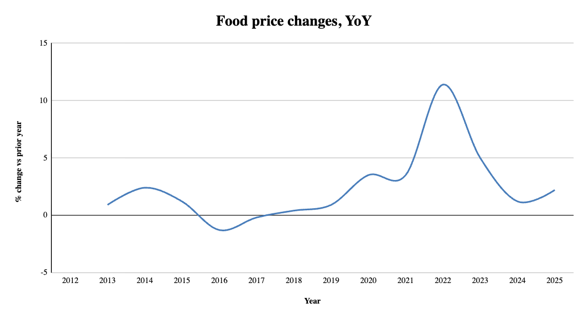
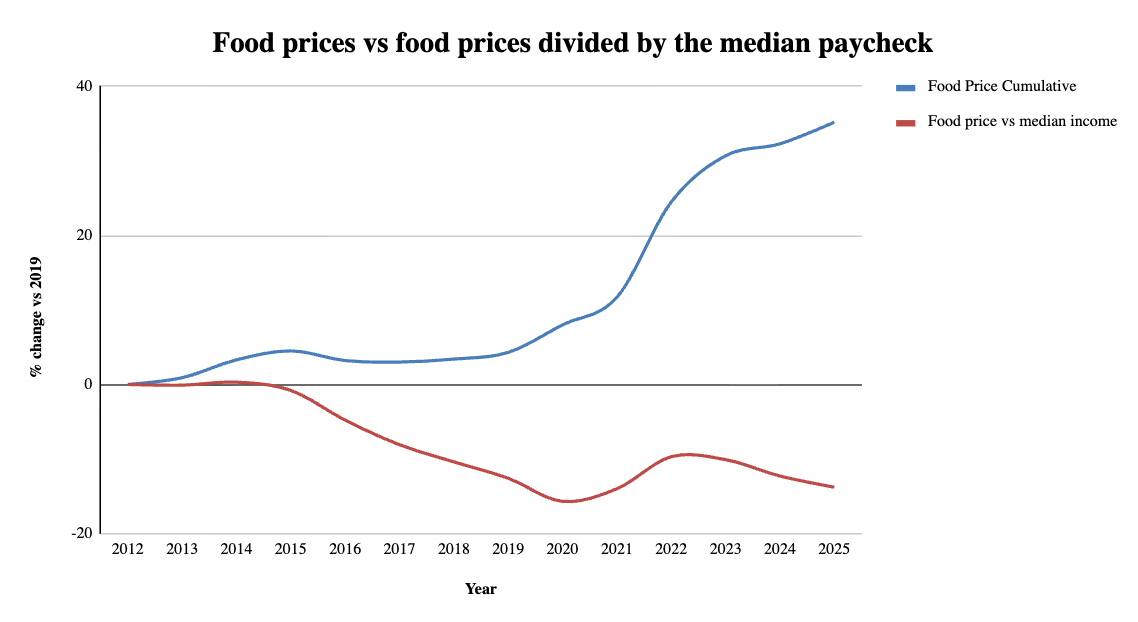
Except, the story isn’t actually true, because for the median American, food has gotten about 15% cheaper relative to wages in the same time:
Hm, but it’s not really median Americans who go hungry, it’s the poorest Americans. So what about food prices vs bottom decile paycheck? Food got about 20% cheaper for the bottom decile wage earners:
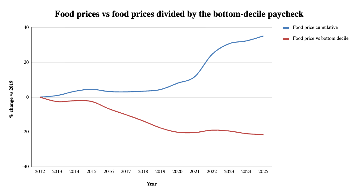
Great, AP is misleading and the world is getting better! Not quite
The above turn out to be just indirect measures of who’s going hungry, and imperfect ones: those wage series count full-time workers, and the hungriest households are disproportionately not headed by full-time workers. Which is exactly why you’d rather have a direct measure, and we’re lucky enough to have one. But sadly, it shows food insecurity getting better, and now worse:
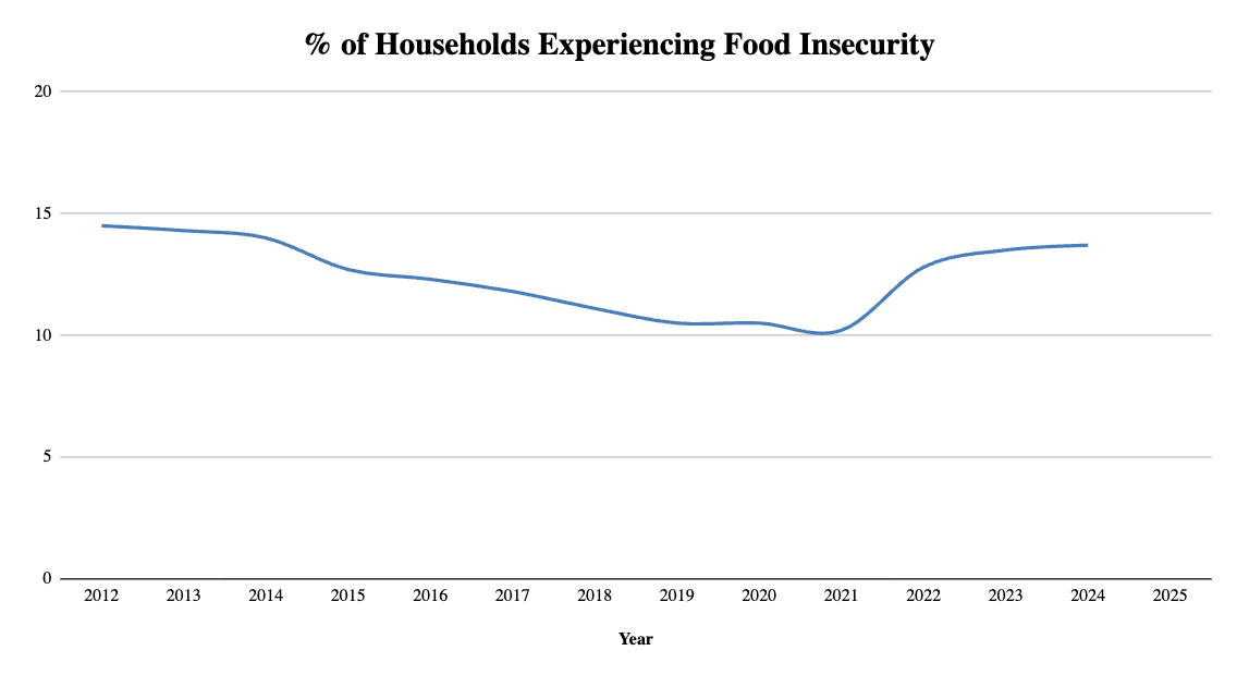
That’s from the USDA ERS survey, which the current regime killed, calling it “fear mongering.” 2024 is the last year anyone measured. So, we no longer even know how many people in the world’s wealthiest country are going hungry.
So, if the price of food is lower relative to incomes, why are more people going hungry in 2024 than 2019 or 2021? Looking at the number relative to 21 is most instructive - in 2021, we had an incredibly comprehensive set of transfers to help ease the burdens of the pandemic for America’s poorest. And then the transfers wound down, and insecurity climbed right back through 2024, the last year USDA measured. When SNAP benefits lapsed for a few weeks during last fall’s shutdown, the private survey still running saw insecurity jump from 13% to 16% almost immediately. And that is what actually drives food insecurity - not grocery prices, but the absence of the social safety net. Which makes the AP chart title particularly problematic, because it’s not only missing the denominator, it’s actually tracking the wrong variable entirely if we’re concerned about people going hungry.
Why did AP publish that chart?
People who are going hungry are not reading AP data journalism. AP publishes an inflation chart (which affects everyone to varying degrees) and then relabel it as “family budgets” for a reader whose own budget is, mostly, fine. The real hunger is elsewhere, tried on as strain here.
That’s who the chart is for: the annoyed. People annoyed at whomever they are annoyed at about the cost of things being higher than they remember it, who need a reminder of that annoyance, and more annoyance fodder in the form of vicarious poverty.
Meanwhile, we don’t quite see the poor, and are seeing them even less than before with our government shutting down a 30 year old survey for “fear mongering”. We end up with one institution amplifying a feeling spuriously, and another erasing the measurement.
As we’re starved for actual data, all we’re going to get is more truisms, like “inflation is a positive number, again”. In 2032, AP will run this chart again, the line a little higher, relabeled to whatever makes good clickbait then, and it will still be accurate, and it will still mean nothing. I just hope that next to it there’s a food insecurity number below 10% again, with an unfortunate gap in the data from 2024 to 2028.